Vertical browser tab challenges
Created
Vertical browser tabs will add more complexity to web development if they ever become mainstream.
Classical horizontal browser tabs
┌──────────────────────────────────────────────────┐
│ Tab1 │ Tab2 │ Tab3 │ Tab4 │ Tab5 │ + │           │
├──────────────────────────────────────────────────┤
│ https://example.com                              │
├──────────────────────────────────────────────────┤
│                                                  │
│                                                  │
│                                                  │
│                                                  │
│                                                  │
│                                                  │
│                                                  │
│                                                  │
│                                                  │
│                                                  │
└──────────────────────────────────────────────────┘
Traditionally, browser windows are shown as tabs with a navigation located at the top of the browser. We all learned those patterns over the past decades. Many other programs now offer similar tabs. Every desktop browser has that, which I care about here.
New vertical browser tabs
┌──────────────────────────────────────────────────┐
│ https://example.com                              │
├──────┬───────────────────────────────────────────┤
│ Tab1 │                                           │
├──────┤                                           │
│ Tab2 │                                           │
├──────┤                                           │
│ Tab3 │                                           │
├──────┤                                           │
│ Tab4 │                                           │
├──────┤                                           │
│ Tab5 │                                           │
├──────┤                                           │
│  +   │                                           │
└──────┴───────────────────────────────────────────┘
Some browsers can show tabs on the (left) side and I think that makes a profound difference in how websites and web applications feel.
Browser support for vertical tabs
| Browser | Vertical tabs |
|---|---|
| Google Chrome | ❌ |
| Safari | ❌ |
| Firefox | ✅ |
| Edge | ✅ |
| Brave | ✅ |
| Vivaldi | ✅ |
| Arc | ✅ |
| Zen browser | ✅ |
I discovered vertical tabs with Arc - a nice implementation with groups (spaces). At the time of this writing many browser already support vertical tabs. But vertical tabs UI can only become mainstream with support by Google Chrome. Safari has a vertical menu for tab groups, but I consider that something else. Vertical tabs in Firefox look ugly to me. Details differ.
Pros
I used vertical tabs for a while now and in general I like them. Although maybe it's the shiny new object syndrome? What I like:
- More readable page titles in tabs
- Vertical scrolling if a lot of tabs are open
- Websites feel more like web apps (skip to content)
- Hide tabs to get screen estate back
Cons
I use the browser 12 hours a day. Maybe vertical tabs for pro users like me only?
- Sometimes I have trouble recognizing the active tab
- Vertical tabs occupy precious screen estate (see below)
Challenges
Designing a responsive layout that also supports view ports with vertical tabs is yet another challenge for web developers. I am surprised how many websites and web apps are semi broken. Some are displayed in mobile mode, hiding important navigation behind a burger or overlaying elements, just because I have the vertical tabs open and a breakpoint was reached.
My experience so far
I am about to finish the design system for our new web properties. I dog fooded myself vertical tab screen sizes on smaller and larger screens. With some trial and error I was able to get a decent look on all the different sizes (small devices are not that important for us).
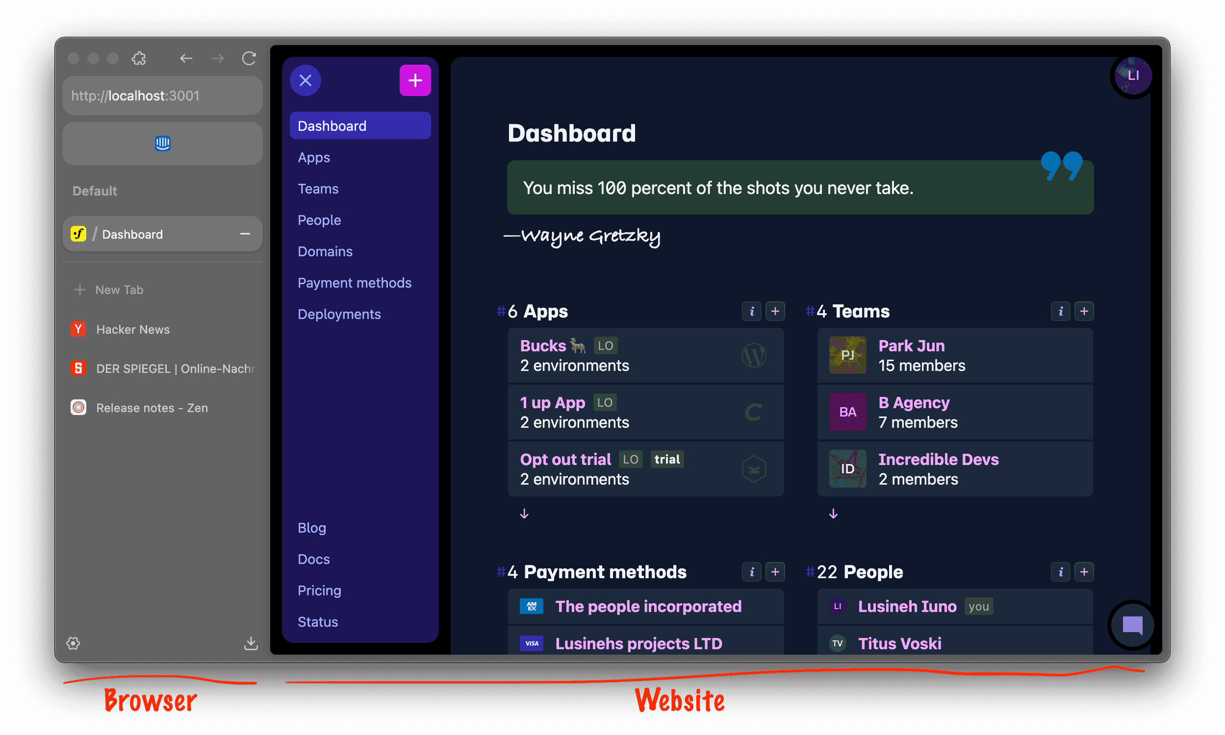
For our new dashboard the main navigation is a vertical sidebar on the left side. It's kinda hard to see where the browser UI ends and where the website UI starts, particularly as the dark mode of the website doesn't play well with the darkish browser UI.
Considerations
Tailwind CSS offers some standard media queries for targeting different screen sizes. Thankfully, it's not opinionated on how those may be used, but screen size assumptions may need to be treated with more care.
- Add more media query breakpoints? Maybe.
- Yet another media query?
@media only screen with verticalTabs and (max-width: 600px). Hm. - Container queries instead of outer window size media queries? Maybe.
Fluid layout
Fluid CSS design might be part of a solution too. What the hack are breakpoints anyway? Why does a layout need to break? Can't it be fluid, always look great? We have responsive units like %, vw, vh. And we have the wonderful clamp function. So we can have tamed fluid sizes for all space units (margin, padding) and font size too.
/* Simplistic example */
/* Untested show idea */
h1 {
  font-size: clamp(1.5rem, 3vw, 4rem);
}
At some point a three column layout may need to wrap to a two column layout, but I can imagine to achieve that without media queries
Certainly something I would like to explore more, unfortunately missing time to dig deeper into it. I have started working on a fluid linear scale design system with my former Teutonic CSS system. I don't think that such ideas exist in Tailwind world.