Image processing in Craft CMS with the Image Toolbox plugin

This article is a bit older and might be outdated.
Using the Image Toolbox plugin, you can create responsive pictures with WebP variants and automatically generate placeholders in case an image asset is missing.
Introduction
Craft CMS offers developers a robust functionality for transforming and processing images uploaded through its control panel, allowing for seamless integration with templates. Leveraging the power of image transforms, developers can effortlessly modify image proportions, size, format, and more.
While this functionality provides a solid foundation, Craft CMS does not support more advanced functionalities out of the box, such as automatically generating WebP versions of images, implementing responsive images, and automatically creating image placeholders for missing images.
Recognizing the need for a simple solution to introduce these functionalities, I created Image toolbox plugin. In this article, I will present practical examples of how this plugin can be used.
Picture HTML tag
Image Toolbox does not replace Craft CMS images transform engine - it is strictly a templating tool. It uses either native Craft CMS image transforms or these provided by Imager-x plugin. Imager toolbox main feature is outputting images using the picture HTML tag. This tag works similarly to the standard img tag, but it also offers a very useful feature - it can contain multiple source tags within itself, each using a separate image URL, and displayed under specific conditions. This is particularly useful for presenting browsers with multiple versions of image to choose from.
WebP version of images
WebP is an image format that has gained popularity in recent years. Compared to JPG, it can offer 30% to 50% savings in image size, resulting in significant bandwidth savings when it is used. But if we want to use the WebP version of an image, can't we just use regular Craft CMS image transforms and set the format to webp? The problem lies in the fact that WebP is not universally supported by all browsers. While the latest versions of modern browsers support it, Safari browsers on older Apple devices do not. This is especially problematic since Safari on these devices cannot be updated to the latest version.
This is where the picture element comes in handy. Thanks to multiple source elements, we can output both the WebP and the original format version of an image. The browser will obviously not download both of these versions (this would go against our goal of saving bandwidth using the WebP format). If the browser supports WebP, this format of the image will be loaded; otherwise, the original format will be loaded.
Here's a simple example where we output a transformed version of an image using the craft.images.pictureMultiple() function.
{% set someAsset = entry.imageField1.one() %}

{% set settings =
  [
    {
      asset: someAsset1,
      transform: {
        width: 200,
        height: 500,
        mode: 'crop',
      },
    }
  ]
 %}

{% set htmlAttributes = {
  class: 'some-class',
} %}

{{ craft.images.pictureMultiple(settings, htmlAttributes) }}
This function accepts a nested array of objects. In our example, we have only one object, but we can include multiple objects for the sake of responsive images functionality, which will be explained later. The transform sub-object follows the regular Craft CMS transform syntax. Image Toolbox will create such a transform with two versions: one in the original format and one in WebP. The function also accepts an optional second attribute, which is an array of HTML attributes to be applied to the rendered picture.
Here is the generated HTML:
<picture>
  <source type="image/webp" srcset="http://website.com/uploads/_200x500_crop_center-center_none/image1.webp">
  <source type="image/jpeg" srcset="http://website.com/uploads/_200x500_crop_center-center_none/image1.jpg">
  <img src="http://website.com/uploads/_200x500_crop_center-center_none/image1.jpg" class="some-class">
</picture>
As you can see, we have two sources, each with a different type attribute, allowing the browser to select the correct one based on its format support. The picture element also contains a fallback <img> tag, which would be used if the browser does not support the picture element at all. Any attributes applied to this tag will be applied to the entire picture element.
It's worth noting that if we explicitly specify that we want the WebP format in the transform settings, only the WebP version will be outputted. Image Toolbox is also smart enough not to try to convert SVG images to WebP, as SVG has its own unique qualities as an image that would be lost during WebP transformation.
Responsive images with multiple variants
The picture element, along with multiple source elements, empowers the implementation of responsive images. This approach extends beyond format support, encompassing screen size and media queries. By offering diverse image sources that can differ in format, resolution, or art direction, we dynamically adapt and deliver the ideal image based on the viewer's device and context. This flexibility guarantees an optimal visual experience across different screens and browsing conditions.
One may wonder, why can't we use two regular img tags and employ CSS breakpoints and display: none; to toggle their visibility. Such approach falls short as hiding images through CSS does not prevent the browser from downloading their contents. Consequently, when implementing responsive images with multiple variants, this method would result in increased bandwidth usage.
Let's use the craft.images.pictureMultiple() function again. This time, we will provide it with multiple assets and transform settings. Each object representing a source has an additional media property.
{% set settings =
  [
    {
      asset: someAsset1,
      transform: {
        width: 200,
        height: 500,
        mode: 'crop',
      },
      media: '(min-width: 1024px)',
    },
    {
      asset: someAsset2,
      transform: {
        width: 100,
        height: 100,
        mode: 'crop',
      },
      media: '(max-width: 1023px)',
    }
  ]
%}

{% set htmlAttributes = {
  class: 'some-class',
} %}

{{ craft.images.pictureMultiple(settings, htmlAttributes) }}
Here is the generated HTML code:
<picture>
  <source type="image/webp" srcset="http://website.com/uploads/_200x500_crop_center-center_none/image1.webp" media="(min-width: 1024px)">
  <source type="image/jpeg" srcset="http://website.com/uploads/_200x500_crop_center-center_none/image1.jpg" media="(min-width: 1024px)">
  <source type="image/webp" srcset="http://website.com/uploads/_400x500_fit_center-center_none/image2.webp" media="(max-width: 1023px)">
  <source type="image/jpeg" srcset="http://website.com/uploads/_400x500_fit_center-center_none/image2.jpg" media="(max-width: 1023px)">
  <img src="http://website.com/uploads/_200x500_crop_center-center_none/image1.jpg" class="some-class">
</picture>
In this example, the browser will not only select the source based on WebP support but also on the media query. Different sources can use different assets, but you can also use the same asset for all and differentiate them only by the transform settings. If you don't want to display any image at all on a specific breakpoint, simply set both the asset and transform to null. The Image Toolbox will output an empty transparent pixel for the specific source in this case.
Instead of passing the entire media query into the source settings, you can also use just the min or max attributes, like this:
{% set someAsset1 = entry.imageField1.one() %}
{% set someAsset2 = entry.imageField2.one() %}

{% set settings =
  [
    {
      asset: someAsset1,
      transform: {
        width: 200,
        height: 500,
        mode: 'crop',
      },
      min: 1024,
    },
    {
      asset: someAsset2,
      transform: {
        width: 100,
        height: 100,
        mode: 'crop',
      },
      max: 1023,
    }
  ]
%}
{{ craft.images.pictureMultiple(settings) }}
This will generate the same HTML code as the first example.
Using responsive images with Transform Layouts
If you are utilizing specific image transforms and breakpoints in multiple template files and want to avoid duplicating code, you can use transform layouts. They are defined in the plugin's configuration file, with transformLayouts setting. By using this setting, you can conveniently centralize the definition of your image transforms, making it easier to manage and maintain consistent transformations across various templates.
Let's define a transform layout with the handle someHandle in the config/image-toolbox.php file:
'transformLayouts' => [
  'someHandle' => [
    'variants' => [
      [
        'media' => '(max-width: 999px)',
        'transform' => [
            'width' => 300,
            'mode' => 'crop',
        ]
      ],
      [
        'media' => '(min-width: 1000px)',
        'transform' => [
          'width' => 600,
          'mode' => 'stretch',
        ]
      ]
    ],
    'attributes' => [
      'class' => 'some-class'
    ],
  ],
],
As you can see, the syntax is quite similar to the one used by the Twig craft.images.pictureMultiple() function. However, it omits the assets, which need to be provided from the template. To output picture with Transform Layout, we can use craft.images.layout() function:
{% set someAsset1 = entry.imageField1.one() %}
{% set someAsset2 = entry.imageField2.one() %}
{{craft.images.layout([someAsset1, someAsset2], 'someHandle')}}
In this example, someAsset1 will be used for the first source element, and someAsset2 for the second one. If you want all sources to share the same asset, simply pass a single asset to the function, and the Image Toolbox will use it for all sources, like this:
{% set someAsset = entry.imageField.one() %}
{{craft.images.layout(someAsset, 'someHandle')}}
Using transform layouts offers one more advantage. HTML attributes applied to the picture element can be dynamically calculated based on the asset objects. This can be achieved using an anonymous PHP function:
'transformLayouts' => [
  'someHandle' => [
    'variants' => [
      [
          'media' => '(max-width: 999px)',
          'transform' => [
              'width' => 300,
              'mode' => 'crop',
          ]
      ],
      [
          'media' => '(min-width: 1000px)',
          'transform' => [
              'width' => 600,
              'mode' => 'stretch',
          ]
      ]
    ],
    'attributes' => function($assets){
      if(!is_null($assets[0])){
        if($assets[0]->getFieldValue('someField') != ''){
          $title = $assets[0]->getFieldValue('someField');
        }else{
          $title = $assets[0]->title;
        }
      }else{
        $title = null;
      }
      $attrs = [
        'title' => $title;
      ];
      return $attrs;
    },
  ],
],
In the example above, we use the first asset passed to the layout method to determine the title attribute value for the picture element. If the field using someField handle, assigned to the asset, has content, we use it as the title. If it is empty, we use the asset's own title attribute instead. If the asset is missing, we simply exclude the title attribute from the output. By placing this code in PHP configuration file, we can make our Template code simpler and more robust.
Image placeholders
Using image placeholders offers several benefits. They can be employed during the development phase of a website or when an actual image is missing. Placeholders play important role in maintaining the layout and structure of the page, ensuring that missing images do not alter the overall appearance of the website.
In Craft CMS, the one() method of the element query returns null when an asset is missing from a specific field. Therefore, when we pass null instead of an asset object to Image Toolbox functions, it generates a placeholder image for that source within the picture element. The placeholder image utilizes the width and height settings from the provided image transform, preserving the same proportions as the actual image would have. If only the width or height attribute is set in the transform, Image Toolbox creates a square placeholder with both dimensions set to the same provided value.
Image Toolbox offers three methods of generating placeholders:
- Svg mode: Outputs a transparent SVG image as the placeholder.
- Url mode: Utilizes an external placeholder generation service, such as placehold.co.
- File mode (default): Generates placeholders by using a specific base image as the base and adding empty space at the sides or top and bottom to ensure the placeholder maintains the same proportions as the missing image.
The placeholder mode can be changed using the placeholderMode plugin setting; however, it is usually best to leave it in file mode. In file mode, the placeholders utilize the default gray source graphic provided by the plugin, but it is simple to change it to any other image (using the filePlaceholderPath setting) to fit the website's graphical design. Additionally, you can customize the color of the empty space added to the placeholders (using the filePlaceholderBackgroundColor setting).
Below there is an example transformed image and placeholder generated from the same set of transform settings. As you can see, base placeholder image has empty space added to the sides make it same proportions as the missing image.

Image variants field
All functionalities described so far belong to Lite version of the plugin, which is available for free. If you want to provide your admin panel users with more control over your images, you can utilize the Image Variants field, available in the Pro version, costing 19$.
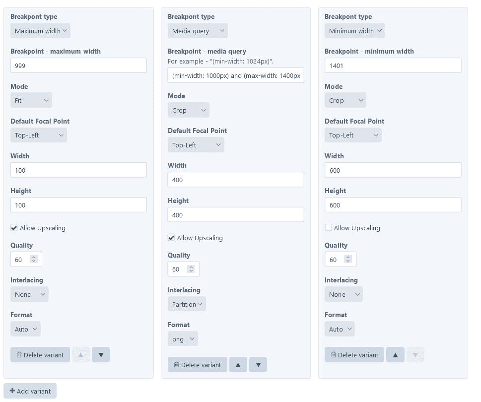
With the Image Variants field, you can configure picture variants with transform and breakpoint settings for all images in the asset source. Additionally, you can specify whether the pictures should use width and height attributes or have webp variants generated for their sources. These settings can be assigned to the asset source field layout and defined in the field settings. Moreover, you can override this configuration for specific assets by defining settings in the field values of those assets.
To output picture with configuration defined using Images variant field, you can use pictureFromAsset() method:
{% set img = entry.someAssetField.one() %}
{% set htmlAttributes = {
    class: 'some-class',
} %}
{{craft.images.pictureFromAsset(img, 'variantField', htmlAttributes)}}
In this example, variantField is handle of the Image Variants field assigned to the asset source. Below is a screenshot showcasing the Image Variants settings, with three picture sources defined:

Alternative solution - ImageOptimize plugin
An alternative to the Image Toolbox plugin is ImageOptimize. This plugin also provides functionality for generating responsive images; however, it does not include automatic placeholder and WebP version generation. Instead, it offers lazy loading functionality, which displays a lightweight silhouette until the actual image loads.
Similar to the PRO version of Image Toolbox, ImageOptimize offers a control panel interface using fields assigned to asset sources. In terms of pricing, ImageOptimize is priced at $59, whereas the PRO version of Image Toolbox costs $19.
Summary
In conclusion, the Image Toolbox plugin for Craft CMS enhances the image processing capabilities of the platform, offering advanced functionalities that are not available out of the box. By providing seamless integration with basic image transform system, it empowers developers to effortlessly generate WebP versions of images and implement responsive images with multiple variants. The plugin's ability to generate image placeholders further contributes to maintaining the layout and structure of a website, ensuring a consistent visual experience even when images are missing.
With this set functionalities, Image Toolbox proves to be very useful tool for developers looking to optimize image delivery on Craft CMS-powered websites.
Further reading
Related Craft CMS reading
- Things to know about fast Craft CMS websites — image work is often a top performance lever.
- Opinionated Craft CMS 4 upgrade guide — what to know before upgrading.
- User account management with Craft CMS — more practical Twig-template patterns.
DISCLAIMER: fortrabbit has co-sponsored this blog post. It's cross published here. The original version can be found over at craftsnippets.com